top of page

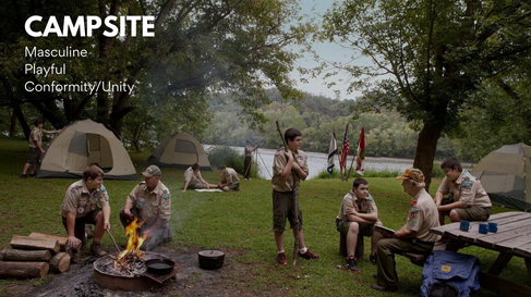
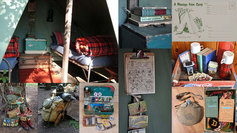
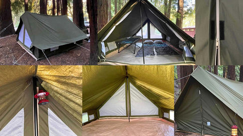
Research/Mood Boards
Designer Statement:
When approaching the design for Iron Lake it was important to the director and I to establish a beautiful world set during a sunny day to juxtapose the horror that later occurs in the film.
I wanted everything to feel functional and purposeful. The camp should have a sense of playfulness that is masking the underlying conformity that haunts our lead character Scott who is battling his sexual identity.
Setting the world in a neutral color palette we decided to use Red to represent the metaphor of horror, and Blue to represent Eddie which later becomes the color that will haunt Scott.
T
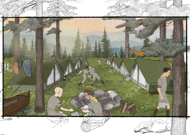
Concept Illustrations
BTS Photography
bottom of page


